When the end of the year approaches it seems that everyone starts practicing their favourite sport: making price predictions for next year... Alright, I’m in!
The Ecoinometrics newsletter helps you navigate the landscape of digital assets and macroeconomics with investment strategies backed by data. Subscribe now to get the latest research directly in your inbox.
Done? Thanks! That’s great! Now let’s dive in.
Bitcoin price prediction 2023
I’m not big on making price predictions. Too much uncertainty to be useful. Better to think in probabilistic terms, reward to risk ratio and so on.
That being said it is that time of the year where everyone is making their prediction for what’s coming up in 2023. So why not. Why not give it a shot.
There is no such thing as a correct methodology that will lead to accurate price predictions. But at least let’s try to make our reasoning explicit.
So here is the idea:
Bitcoin is in a bear market.
We have had bear markets in the past.
We can look at the historical returns during those periods and apply them to the current price.
That will give us a price range looking forwards.
With this method we are making the assumption that past bear markets are a reasonable guide for what’s happening right now. I’ll let you be the judge of that. But at least our assumptions are clear.
So the first thing we can do is take the past Bitcoin bear markets and look at the distribution of returns during those periods.
We’ll do the calculations on a 30 days basis so that the numbers are easier to interpret.
And we’ll break down the distribution in three groups:
The distribution of returns during the whole drawdown corresponding to a bear market.
The distribution of returns in the recovery phase of the bear markets, that is after the bottom as been made.
The distribution of returns during the correction phase of the bear markets, that is from the start of the drawdown until the bottom is made.
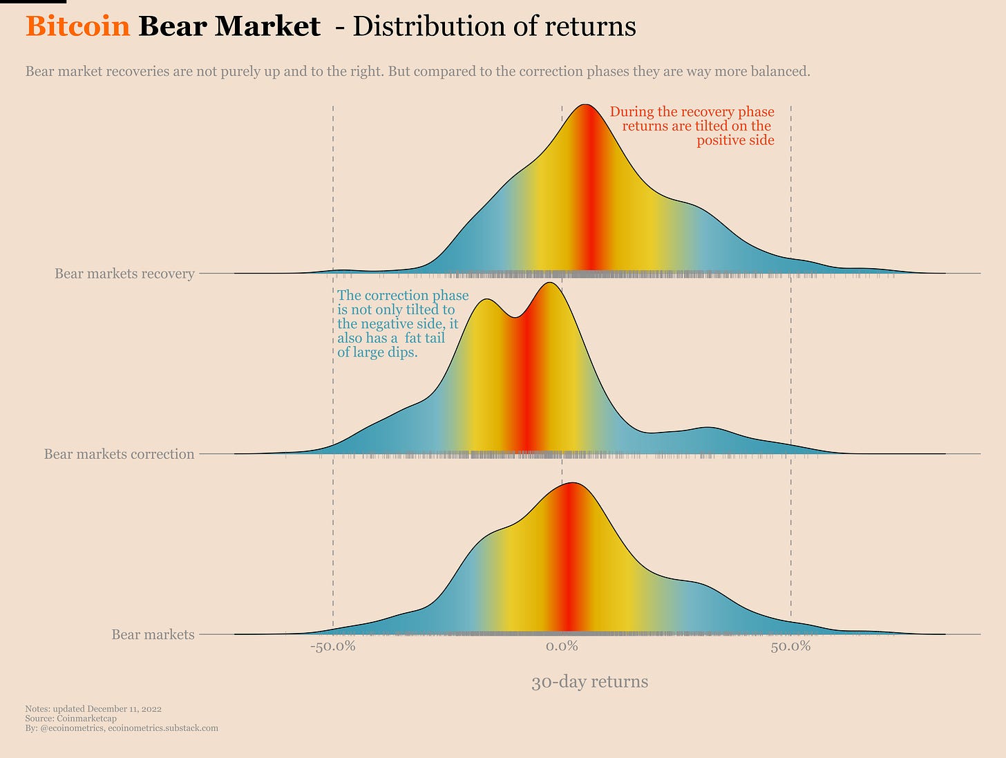
On the chart below each day corresponding to a 30-day return of Bitcoin during one of those periods. We are plotting the density of those days. The density is colour-coded such that the closer you are to red the closer you are to the average return of the distribution.
Check it out.
From top to bottom we have:
The bear markets recovery phase.
The bear markets correction phase.
The bear markets as a whole.
The distribution of returns in the recovery phase is characterized by the fact it is clearly tilted towards positive returns. But as you can see that doesn’t mean it is all up and to the right. This distribution overlaps the negative side significantly. It is just more balanced than during the correction phase.
Because the correction phase has two modes (the peaks). One mode around zero and another one pretty deep in negative return territories. Moreover it has a fat tail of large negative returns. And while there are good periods during the correction phase (those famous bear market rallies) the distribution is pretty thin on the side of positive returns.
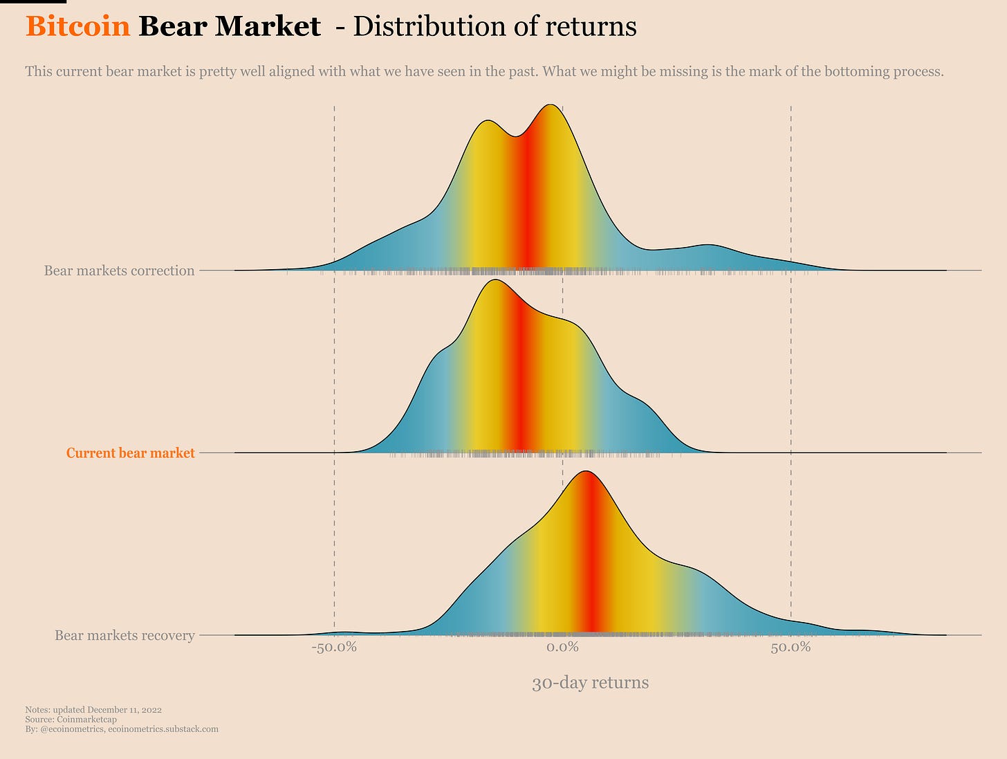
Actually maybe it makes sense to add one more thing to this chart. Here I’ve only considered the past bear markets for Bitcoin. But how about we add the distribution for the current bear market to see how it compares?
First thing to observe is that the average return and the mode on the negative side for this bear market is very much in line with the previous bear markets.
The two differences are that this bear market has not experienced too many left tail events (so far). And it also doesn’t have any mode around zero. Maybe what’s missing here is the bottoming process where we get one sharp drop giving us some left tail event before things get better.
Based on that what makes sense if we want to guesstimate Bitcoin’s price moving forward is to consider two different scenarios:
Scenario 1, Bitcoin has not found its bottom yet.
Scenario 2, Bitcoin has already found its bottom and we are in the recovery phase.
For the first scenario we want to use the full historical bear market distribution as our basis to simulate Bitcoin’s price moving forward.
For the second scenario we can use the historical distribution for the recovery phase of the bear markets to simulate a recovery of Bitcoin.
Those simulations essentially amount to sampling returns out of the respective historical distributions and apply those to a starting price in order to establish price trajectories.
Doing so repeatedly gives a set of price trajectories. We can condense those price trajectories into a distribution of simulated price on any given day.
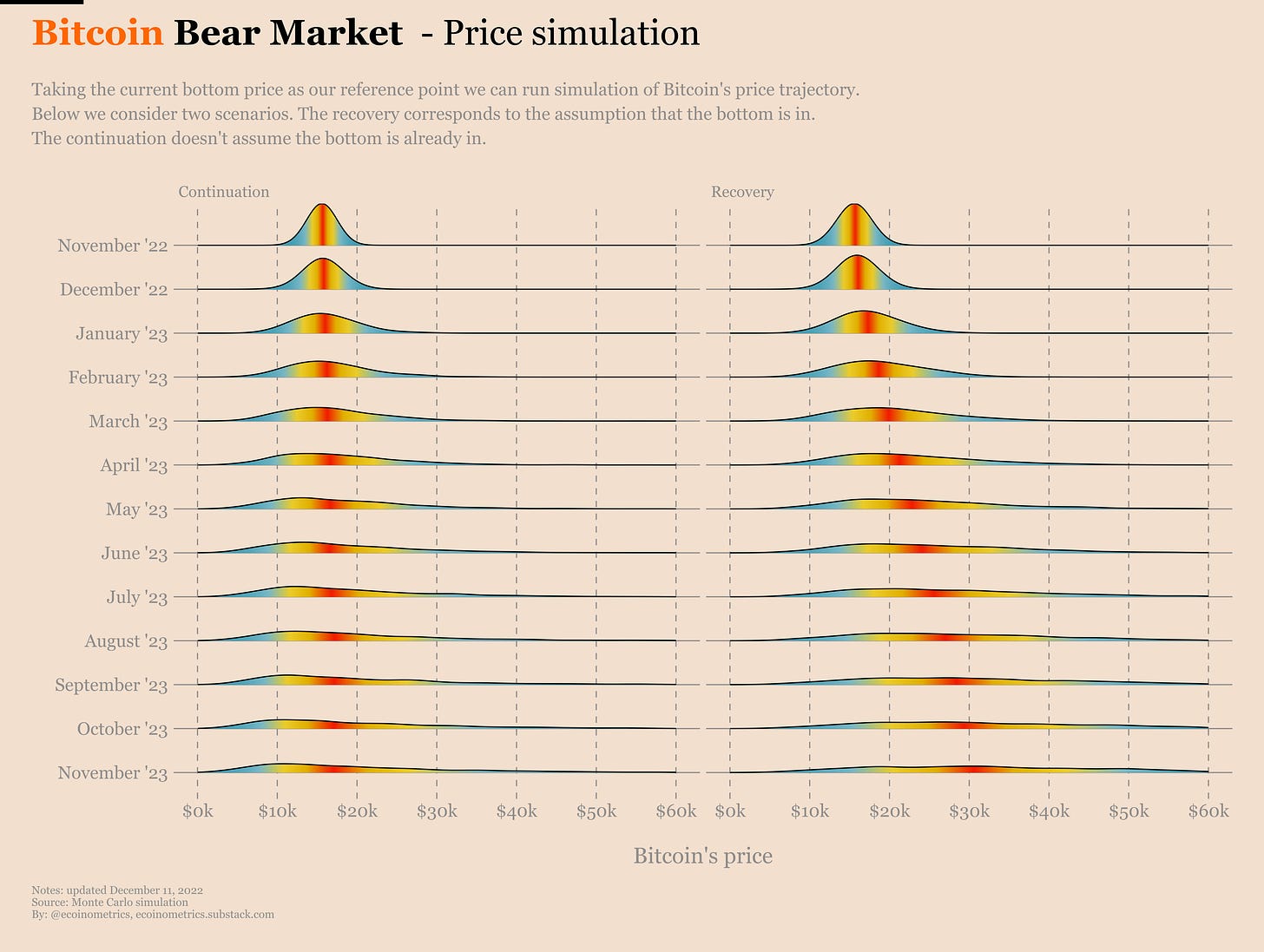
That’s basically what we have plotted below. For each end of the month looking one year forward you can see the distribution of simulated prices.
The higher the density the more time the simulation led to a given price. The red zone is the highest likelihood zone. Moving away from that you get the whole range of possibilities.
You read those charts from top to bottom. At the top is November 2022. At the bottom is November 2023. The left panel is obtained under the assumption that we have not necessarily hit the bottom. The right panel is obtained under the assumption the recovery phase has started.
Price is read on the horizontal axis.
Take a look.
Obviously the further in time you go the less certainty you get on the likely price range.
But here is what we can read from those two scenarios.
Let's start with the continuation scenario. This scenario is based on the idea that we don't know whether or not the bottom is in, which means we must use the entire distribution (correction plus recovery phases) of returns for the previous bear markets.
When you do that and peek one year in the future the result is that the most likely price zone for Bitcoin is between $15,000 and $20,000. Let’s be honest, I’m sure you’d take that in a year that might be marked by a global recession.
But if we follow a bear market continuation scenario there is also a high chance to see Bitcoin slide towards $10,000.
With the recovery scenario we assume the bottom is in. That is we simulate the future based on the returns of the recovery phases of the previous bear markets.
In that case the most likely price range in one year from now is $27,000 to $33,000. This is a +74% to +113% from the current bottom.
This kind of annualized return is very much in the typical range of annualized returns for Bitcoin.
on the low range when it comes to Bitcoin. Not too bad for a bear market.
So what’s the tl;dr? Making predictions is hard, especially about the future. But we can make some reasonable assumption regarding the market regime we are in. And based on those assumption and the history of previous bear markets we can extrapolate a most likely range for the price a year from now:
Under an assumption that the bottom is not in $15k to $20k is a likely range.
Under and assumption that the bottom is in a $27k to $33k range is likely.
Those predictions aren't really hopium grade but hey it is what it is. Don't expect miracles during a bear market.
Bitcoin metrics
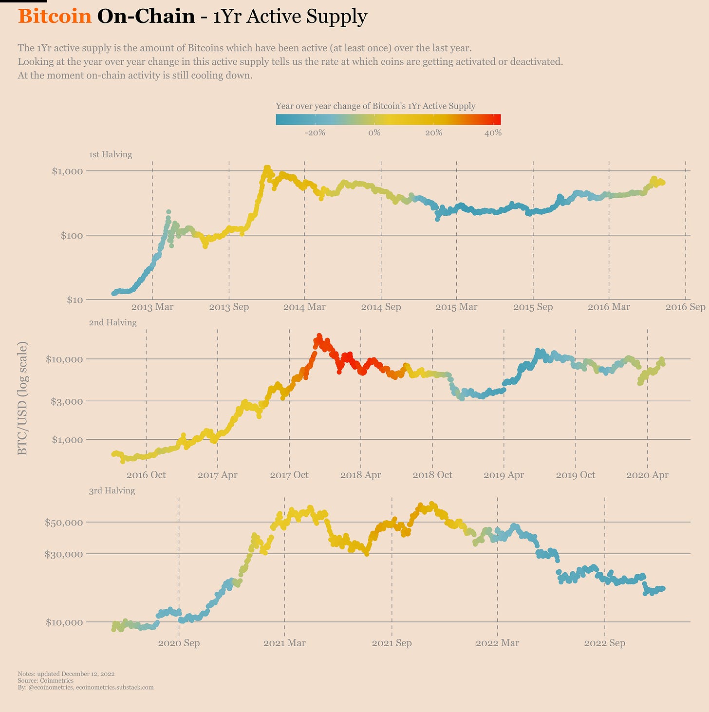
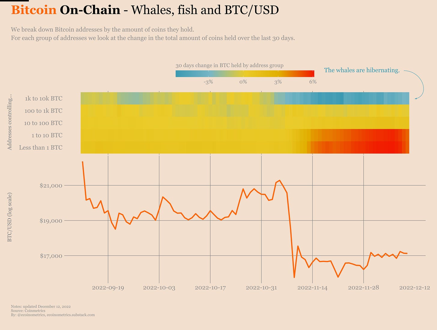
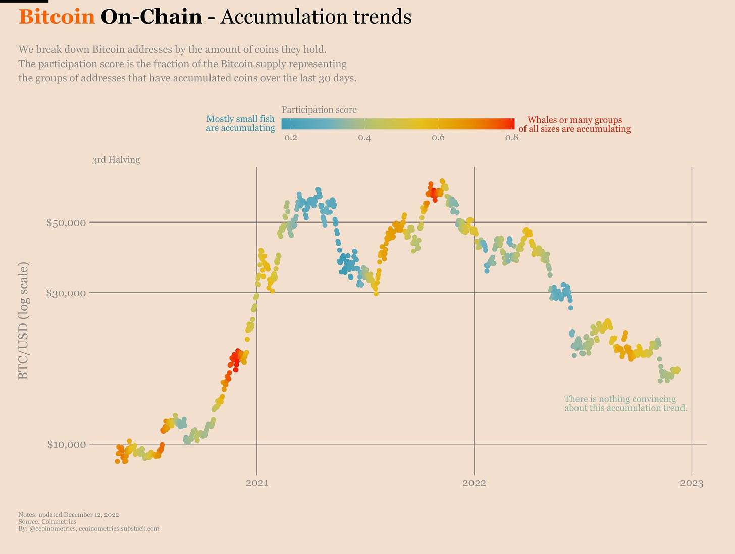
Not gonna lie, the on-chain data is pretty weak for Bitcoin. The activity is in deep bear market territory.
The whales are hibernating… if that’s even a thing.
And the result is some tepid accumulation score.
A total lack of action. That's the main theme for Bitcoin at the moment. There is no dynamic in the market. We are in a purely reactive mode:
Some news about bad actors in crypto... Bitcoin drops.
Some news about macro... Bitcoin... does something.
But by and large there is very little volatility and basically no direction in the market. There is no trend. The price action is at the mercy of good and bad news. Meaning it is still time to be cautious.
Resources
Here are some things we released recently that you might have missed:
A dollar cost averaging performance calculator for the stock market. A Bitcoin version of the calculator is coming.
A heat map of where to invest to beat inflation. We’ll be updating the charts this week with the new inflation print for November.
An analysis of the relative strength index as applied to Bitcoin.
Our take on what’s the most likely path for the macro environment in the next 12 months.
That’s it for today. If you have learned something please like and share to help the newsletter grow.
If you are already a free subscriber please consider upgrading to a paid tier to get the full access including:
Two newsletters every week.
Suggest research topics and request charts.
Cheers,
Nick
P.S. For weekly threads and hot takes follow Ecoinometrics on Twitter.


