This week we continue to explore what kind of information can be extracted from on-chain data for the Bitcoin network.
Last time we categorized addresses from small fish to whales and observed different patterns of accumulation and distribution of coins with the idea that it might tell us something about the market sentiment.
Today we are asking: can we relate that to the price action?
The Ecoinometrics newsletter decrypts Bitcoin’s place in the global financial system. If you want to get an edge in understanding the future of finance you only have to do one thing, click on the subscribe button right below:
Done? Thanks! That’s great! Now let’s dive in.
On-chain participation
First let’s take a quick look at the current situation.
After a couple of weeks of data showing that most address buckets are accumulating coins, Bitcoin is finally bouncing back from the $30k level.
At the same time, whales continue to accumulate pretty strongly. So if we interpret that in terms of market sentiment we could say that everyone seems confident that prices should go higher from there.
This is just on-chain sentiment though. The big question is, how does that correlates to the price action in general?
My thought is the following:
If everyone from small fish to whales is accumulating, it should be good for the price since that makes the market more tight at the same time as it shows a bullish sentiment.
If only the small fish are accumulating then you should be worried about the price as that could mean whales are about to offload their coins.
So let’s see if we can check that.
Hmmm… over long periods of time it is a bit complicated to work visually with the heat map above. So let me replace it by some measure of who is participating in the accumulation trends.
If the next few lines are a bit technical don’t worry. At the end of the explanation I’ll give a simple tl;dr.
Alright.
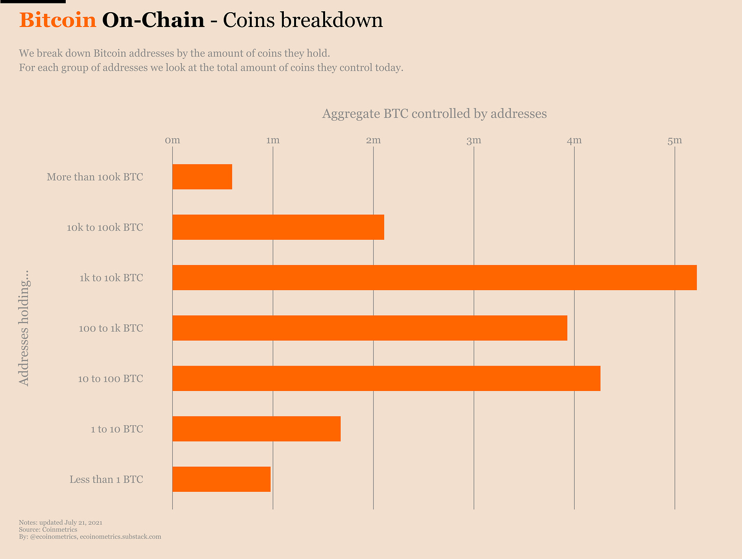
At any point in time each category of address controls a certain amount of coins. Like these days, whales control about 5m coins while small fish control about 1m coins.
We’ll use the ratio of the amount of coins controlled by a group to the current Bitcoin supply as the weight of each category.
E.g. these days whales (1k to 10k BTC) have a large weight while small fish (less than 1 BTC) have a small weight.
At any point in time we also know if a category of address has been accumulating or not. We use that to separate the categories between those who are accumulating vs those who are not.
The participation score is then simply the sum of the weights of all the categories that have been accumulating on a 30 days basis.
E.g. if today only the small fish are accumulating then the participation score is 0.05 or 5% i.e. the fraction of the Bitcoin supply controlled by the small fish.
Tl;dr the participation score tells you if whales/a lot of different groups are accumulating (high score) or if only small fish are accumulating (low score).
Ok.
So let’s see what kind of information we get from this.
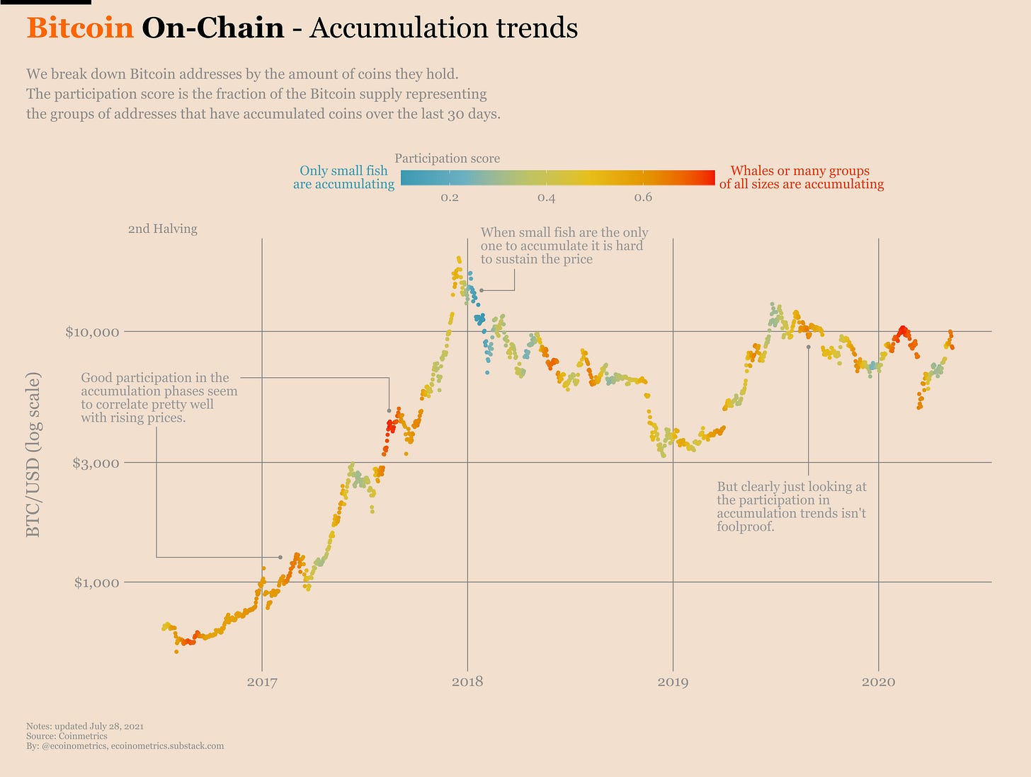
Below is the price chart of BTC (log scale) during the previous cycle. Each point is coloured by the value of the participation score on that day.
Red points correspond to situations where every group has been accumulating in the past 30 days.
Blue points correspond to situations where only small fish have been accumulating in the past 30 days.
Have a look.
So it looks like while it is often the case that the more groups are accumulating the more the price is rising, this is not completely foolproof.
But the situations where only the small fish remain bullish usually means you should be cautious about where the price is heading.
We can do the same plot for the current cycle and we observe pretty much the same thing.
See for yourself.
Now I’m not sure if we can apply the same analysis to the original cycle and the first halving cycle since back then the market composition was likely quite different.
But for the sake of completeness you can check out all the cycles on the chart below.
Ok, so in general blue means danger. Good to know.
There is certainly more information to extract from this data. And of course it would be great to connect all that to the supply dynamic on the exchanges since this is where the price is set after all.
Many questions are still open, we are just scratching the surface. So we’ll dig deeper on-chain in upcoming issues of the newsletter.
CME Bitcoin Derivatives
Bitcoin bounced off the $30k level over the weekend and judging by the spike in volume on Monday this was a big surprise to the futures traders.
But past the shock at the open, I’m not sure this move is enough to really bring back some life into the derivatives markets.
As I write those lines, Bitcoin remains just below $40k. If you look at a price chart you’ll see that this doesn’t count yet as a breakout. A real breakout would be a daily close above $42k which is the pretty much the highest point BTC set in June after the crash.
So while thies mov is encouraging, we aren’t there yet. BTC might as well bounce back down from $40k and we’d stay stuck in the current range.
What are traders thinking about all that?
Well, if we look at the options market you can kind of see the sentiment shifting a little bit.
Overall we have 7 puts for every 4 calls which should tell us that traders are worried about the downside. But, if you break it down by contracts there is actually:
5 puts for every 2 calls in July.
1 put for every 1 call after that.
So the market is skewed towards puts for the July contract which expires in a couple of days. But after that we are back to something neutral. I take it as a sign traders believe there is limited downside from here.
Talking about the July contract which expires at the end of the week, here are the stats:
62% of the positions are about to expire.
31% of the calls are in the money.
18% of the puts are in the money.
This is somehow more balanced than usual.
Overall the trading activity doesn’t look so good though.
Let’s wrap this up by looking at the latest data from the Commitment of Traders report.
First a reminder, there is a one-week delay in the data, so what you see below is a snapshot before Bitcoin bounced back to $40k.
What we see is that the retail crowd wasn’t ready for the bounce. But again, without a clean breakout above $42k I’m not sure so many people will come back on the long side.
The smart money is doing interesting things though. Big uptick in both long and short positions last week. Not sure what’s going on here.
Maybe some play around expectations that volatility is about to return to the market. Or maybe some action around the expiration of the July contract.
We’ll have to check again next week to see where this is going.
That’s it for today. If you have learned something please subscribe and share to help the newsletter grow.
Cheers,
Nick
P.S. For daily updates follow Ecoinometrics on Twitter.


Great site
Love the graphics with the accumulation trends, super cool. Good piece Nick!