Ecoinometrics - Realized Value
September 13, 2021
Not everyone is a long term Bitcoin hodler who just DCA every single day while waiting for BTC to dethrone GLD.
Some investors will look for good entry points to deploy more capital. Others will want to take profit off the table from time to time. And some just want to trade smaller moves in order to grow their stack.
Whatever you are trying to do you’ll want to know one thing: is the market overheated or not?
The Ecoinometrics newsletter decrypts Bitcoin’s place in the global financial system. If you want to get an edge in understanding the future of finance you only have to do one thing, click on the subscribe button right below:
Done? Thanks! That’s great! Now let’s dive in.
Realized value
Right, so how can we try to figure out if the market is over heating or if we have something healthy on our hands?
For sure there is no single metric that can tell you everything.
If you want to get a full picture of the situation you need to look at different qualitative aspects of the market and if possible run some quantitative analysis on them.
Examples of qualitative aspects we can look at are:
Market sentiment. Is the market dominated by greed or fear?
Position with respect to the big trends. How big is the momentum and is the price overextended?
State of profit or loss in the market. In aggregate are investors sitting on potential gains or are they losing money?
Measuring the market sentiment is kind of a complex topic. I won’t go into any detail today but I’m planning to run some experiment starting sometimes in the next couple of weeks. So stay tuned and keep an eye on Twitter.
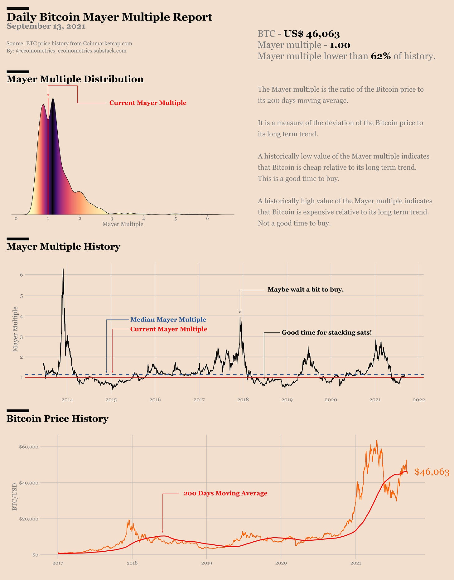
Regarding the big trends, the standard reference is the 200 days moving average. So many traders have their eyes on it than when the price is crossing above you often get a good setup for the start of a big move.
Actually trading the momentum based on this signal alone has a great track record of risk vs returns (as discussed here).
So being above the 200 days moving average is good, but when the price gets too far ahead of it the risks of getting a correction are increasing.
Right now there is no risk of that sort though… Bitcoin is at its 200 days moving average, pretty much in the bulk of its historical distribution. That’s not what you call an overheated market.
See for yourself.
The 200 days moving average analysis is pretty standard and applies to pretty much any asset.
But with Bitcoin we can dig a bit further thanks to the availability of on-chain data.
Everyone is familiar with the notion of market cap. You take the entire supply of Bitcoin, look at the current price and multiply those two. That’s the market cap.
It gives a marginal valuation of Bitcoin i.e. the marginal buyer, the one that has set the last price, determines the total market value of BTC.
It answers the question: if the last buyer was to acquire all the supply at the current price, how much US$ would that be?
Now with on-chain data you know exactly when was the last time every coin was transacted. That means you also know what was the price of Bitcoin at that exact time.
So if you were to look at all the coins, check when was the last time they moved and multiply the amount of coins by the price at that time and sum it all you’d get another valuation of the Bitcoin market.
This is what’s called the realized value of the Bitcoin market and it answers the question: what is the aggregate value of the Bitcoin supply based on the last price at which each coin was transacted?
So we have two different notions of the market value of Bitcoin. There is how much the marginal buyer is ready to pay now i.e. the market value vs what hodlers have bought their coins for i.e. realized value.
If I’m a hodler who is going to sell its coin to the marginal buyer, my profit (or loss) is the difference between this realized value and the current Bitcoin value.
That means the ratio of the market value to the realized value tells us if the market in aggregate is in a state of profit or loss (and by how much).
This ratio is called the market value to realized value ratio (MVRV) and can be interpreted as:
A ratio below 1 means that in aggregate the market is trading at a loss.
A ratio larger than 1 means that in aggregate the market is in profit.
The larger the ratio gets, the larger the potential profit for hodlers.
Now you can imagine that the larger the MVRV ratio gets, the more unrealized profits hodlers are sitting on, the more likely it is that they are going to take profits at some point.
In other words, when the MVRV ratio gets larger and larger, it becomes more and more likely that the market is overheated.
This metric is working pretty well. Check out the chart below.
You can see the price evolution of Bitcoin (log scale) broken down by cycle, where each day is coloured by the MVRV ratio. The darker the colour the higher the ratio.
So we have those big run ups in market value until investors sitting on massive gains start to sell. That brings more supply online and result in a lower marginal price until the market gets back to some equilibrium.
Ok.
Then the big question is how big is too big? At what point does the MVRV ratio gets to unsustainable levels and will lead to a correction?
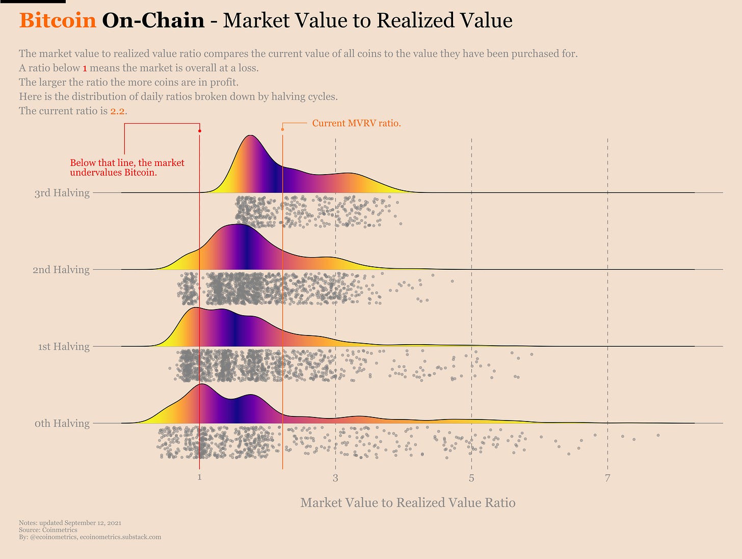
To answer that we can look at the historical distribution of the MVRV ratio broken down by halving cycle.
Some observations:
Over the previous cycles, the MVRV has averaged around 1.5.
There have been spikes as high as 7 but with each cycle those outliers seem to get smaller.
So far in this cycle, the average MVRV is close to 2 and we haven’t really seen big outliers like in the previous cycles.
In particular, the current MVRV is 2.2 which means the market operates at a profit without being particularly hot.
Actually a MVRV ratio of 2.2 is pretty good historically speaking.
Break down the MVRV ratio into categories:
Less than 1.
1 to 2.
…
More than 5.
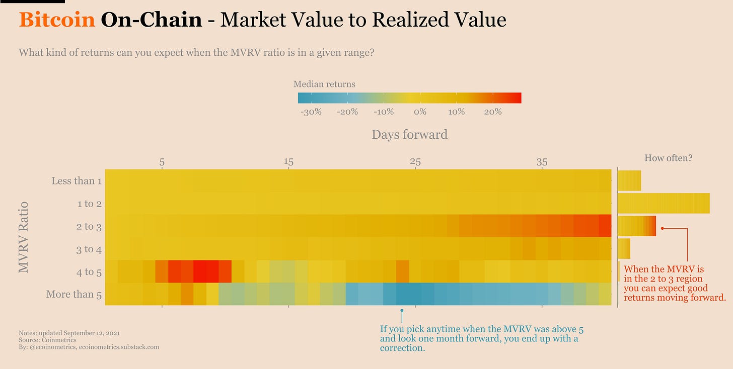
Pick one day in the past. Its MVRV ratio falls in one of those categories. Look at the price action 1 day, 2 days, … 40 days forward and write down the total returns. Repeat that for all the points in each category and you can build some statistics.
So what is the expected return at 30 days when the MVRV ratio is around 2?
Just look at the heat map below:
The third row from the top is the category of points in time for which the MVRV was between 2 and 3.
Go to the right until you hit 35 days forward. That’s about one month from a point with MVRV between 2 and 3.
Then the colour of the cell tells you what is the average return. For this particular example we are in the red which means on average you are up 40% in one month.
See for yourself.
The 2 to 3 range is going towards the red when you move forward in time. That means historically you can expect momentum to pick up within a month when the MVRV ratio is in this region.
Actually in general anything from 2 to 5 gives you positive expected returns at one month.
It is really when you move above 5 that things switch to blue. Said otherwise, historically a MVRV over 5 means you can expect a price correction within a month. That’s one criterion for a overheated market.
And just to be sure that the pattern of averages is not skewed by just one outlier we can do the same analysis using median returns. Turns out the patterns holds.
Check it out.
What is the conclusion then?
Well we have at least two metrics showing that the Bitcoin market is far from being overheated: BTC is at its 200 days moving average and its market value to realized value is actually in a sort of Goldilocks zone.
So if you want to be tactical, now isn’t a bad time to get long.
That’s it for today. If you have learned something please subscribe and share to help the newsletter grow.
Cheers,
Nick


You make it look so simple. Beautiful work!
Thanks, Nick! Awesome analysis 🔥🔥