The Ukraine war is getting a lot of people worried about WWIII. That’s understandable and naturally when investors are scared they start buying safe havens to hedge their bets. Notably Bitcoin doesn’t seem to be one of them…
The Ecoinometrics newsletter decrypts the place of Bitcoin and digital assets in the global financial system. If you want to get an edge in understanding the future of finance you only have to do one thing, click on the subscribe button right below:
Done? Thanks! That’s great! Now let’s dive in.
What kind of hedge?
There is something that comes up all the time in association with the “Bitcoin is digital gold” narrative. It is the idea that Bitcoin in its current state should trade the same way as gold.
That is Bitcoin in 2022 should:
React to inflation news the same way gold does.
Trade like a safe haven when risk grips the market.
Spoiler alert, by and large it does none of that.
This lack of gold-like behaviour is touted by Bitcoin skeptics and people who have other things to sell you (cough Peter Schiff cough) as a fatal flaw which dooms Bitcoin to failure.
I don’t know about that.
You see, trading a certain way on inflation prints or geopolitical events is not an intrinsic property of the asset. It is a property of the narrative around that asset.
Right now the narrative of Bitcoin as digital gold isn’t particularly strong. That’s what the price action is telling us.
But the way the Bitcoin network is designed hasn’t changed. There is still no single point of failure. It is still permissionless. Its monetary policy is still set in code.
That’s why in spite of the digital gold narrative being a bit weaker these days there is no reason for it to fail on a long enough time line.
One thing I want to address in particular though is the claim made by Peter Schiff and others that Bitcoin is not a good hedge against inflation.
Look, I’ve said that before, you don’t judge an asset being a good hedge against inflation by how it reacts to inflation news. It simply doesn’t matter. Inflation is a slow process eroding the purchasing power of your cash. What happens in a single day is irrelevant.
The only thing that matters is whether or not using your cash to buy Bitcoin now will outperform inflation in 1 year, 2 years, 4 years, 8 years… because that’s the definition of being an inflation hedge.
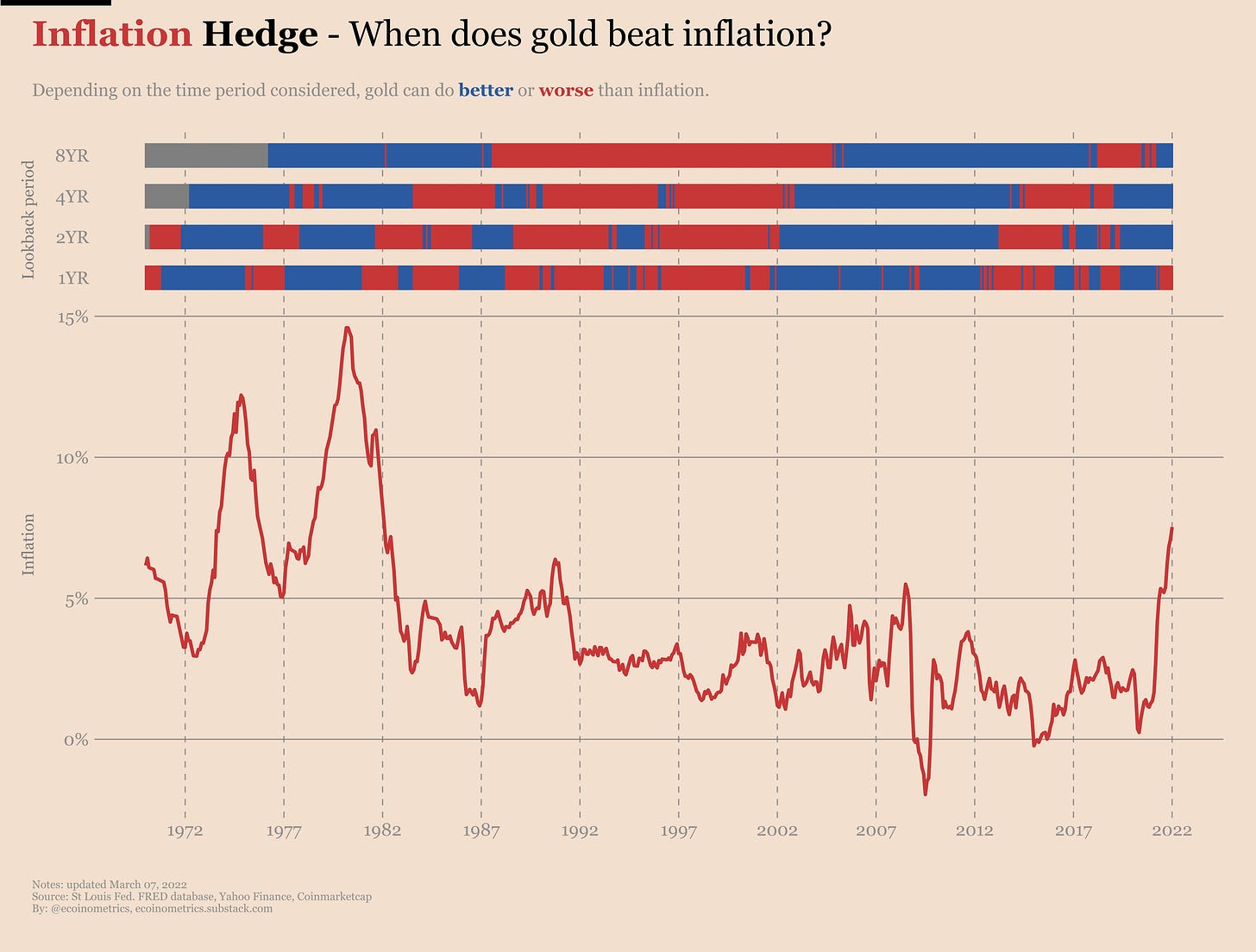
So how does gold perform as an inflation hedge? Well we can do the following:
Every month take the US CPI data and the price of gold at the end of the month.
Check if gold has outperformed the CPI over a lookback period of 1 year, 2 years, 4 years and 8 years.
If gold outperformed the CPI put a blue tick for that month. Otherwise put a red tick.
If we do this every month starting in 1970 the picture looks like that.
When you focus on the longest lookback period, which is 8 years, there are long stretches of time where gold is a good inflation hedge and other periods where it isn’t doing much.
To be fair, gold is doing fine when you want it to do fine. The 70s, no problem. The 2008 financial crisis, doing fine. The COVID crisis, not too bad either. At least if you have a long enough time horizon gold is indeed a hedge against inflation.
As you can see, the shorter the lookback period, the more spotty the records. But again when you are looking for an inflation hedge you are looking over a multi-year period so it should be no big deal.
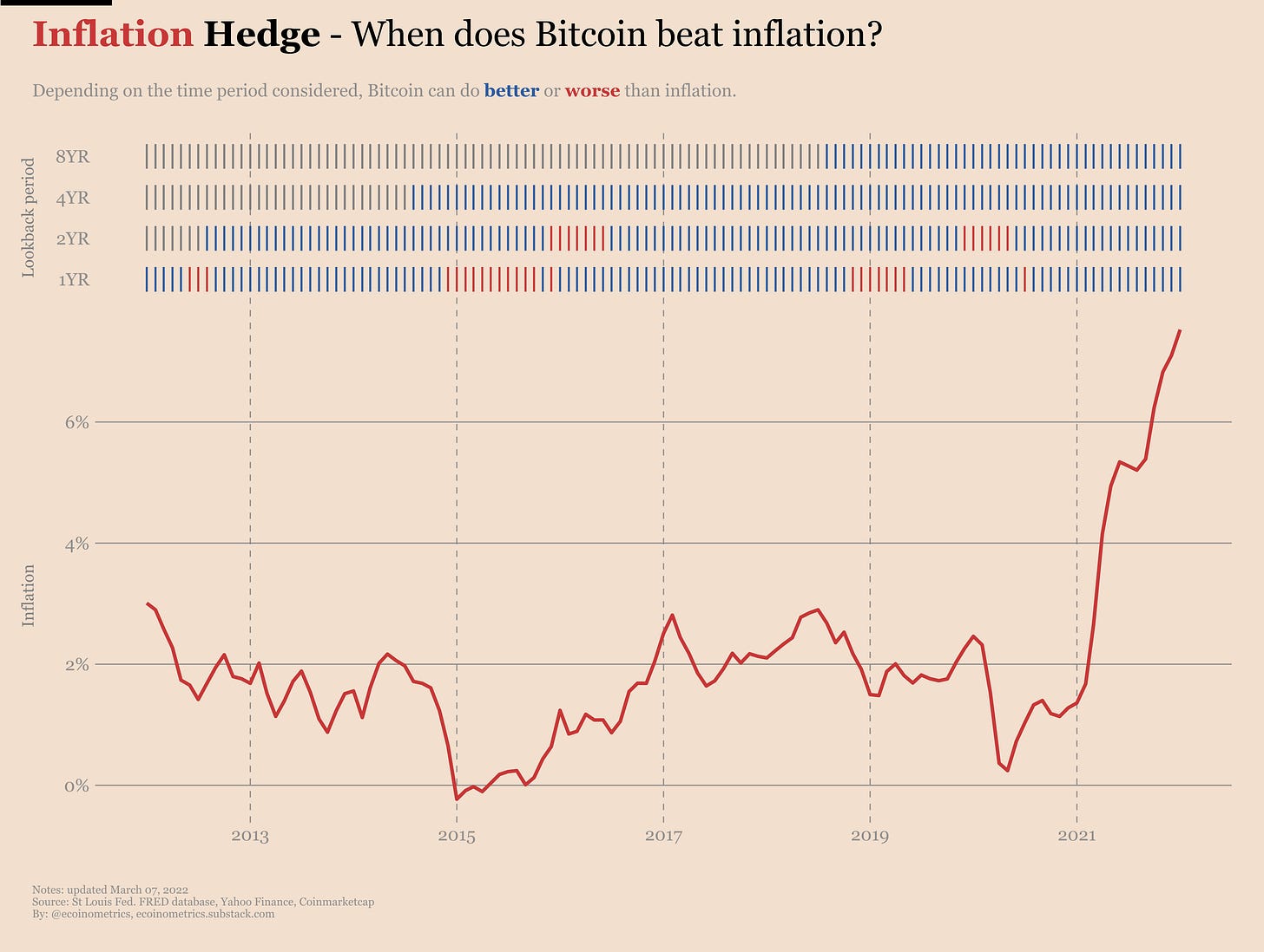
What about Bitcoin? We can apply the same methodology and we get the following results.
Right, it is mostly blue, which means that over its short life Bitcoin (despite trading more like a risk asset) has been a good hedge against inflation.
But of course Bitcoin doesn’t have a history as long as gold, so when it comes to the future we can just try to reason by analogy:
If the digital gold narrative is back in force, Bitcoin is more likely to trade like gold. Thus based on gold’s track record in the 70s we can hope Bitcoin will continue being a good inflation hedge.
It could also be that the adoption trend resumes for other reasons. A narrative around a parallel currency developing as an alternative to the central banks dominated system could get some legs, especially as central banks are going to start rolling out CBDCs. In that case you can expect another parabolic leg which is very likely to beat inflation.
Finally Bitcoin could stay a full on risk asset. What then?
For the last option we can compare Bitcoin to the reference in terms of risk assets i.e. the stock market.
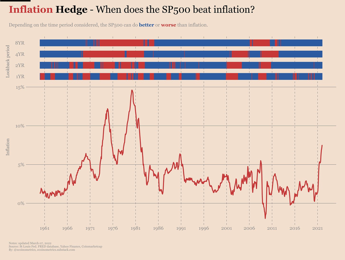
The same analysis that we did for gold yields the following result for the SP500. Take a look.
If we look at the 70s then we should be worried indeed. Any cash that you would have put in the stock market between roughly the middle of the 60s and the middle of the 70s would have underperformed inflation if you held your position for 8 years.
What that tells us, if anything, is that we can expect the stock market / risk assets to not perform so well during periods of rising inflation when the Federal Reserve is in the process of raising rates.
So it is important to monitor the narrative as the Fed is about to give us a repeat of the 70s.
Accumulation trend
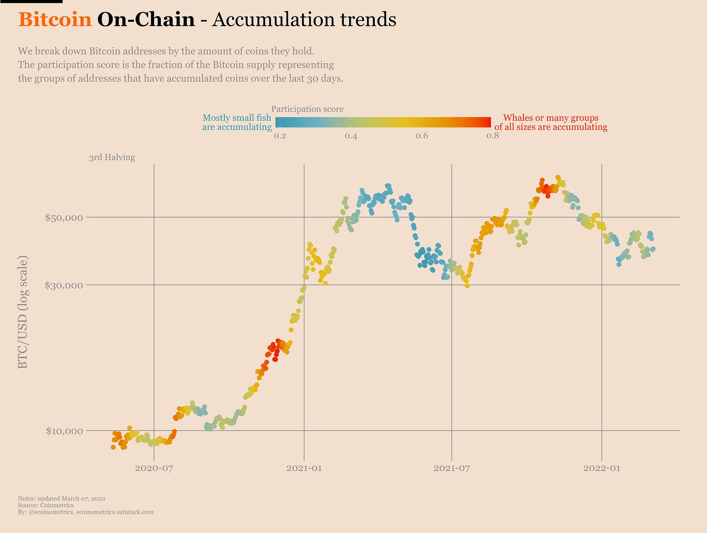
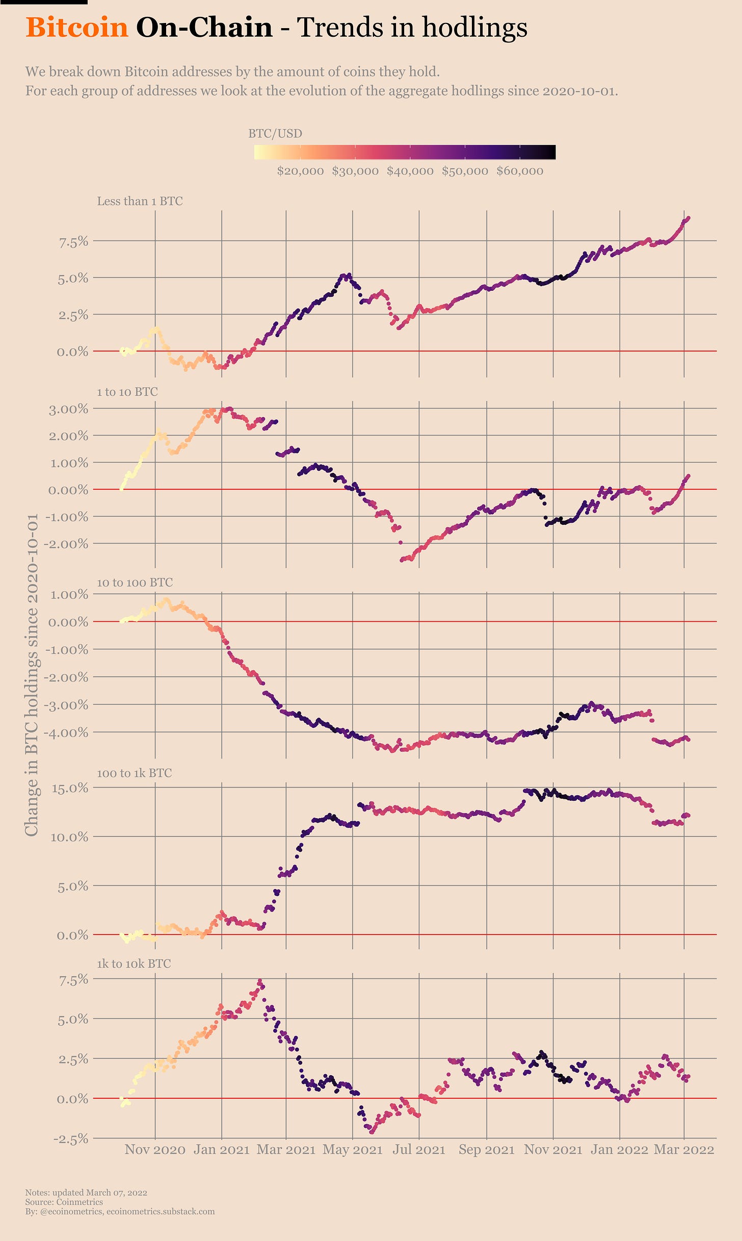
Looking at the latest on-chain data, Bitcoin’s accumulation trend is sluggish. No big news here. The participation score has been towards the bottom of its range for a while now.
Yes, the whales have been buying the dips. Yes, the small fish have been stacking sats consistently. But that’s not enough momentum to get us anywhere.
Something interesting is that for the first time in almost a year the addresses controlling 1 to 10 BTC have crossed above their hodling level from the start of the bull market in the fall of 2020.
But can they keep up the trend? That’s less clear.
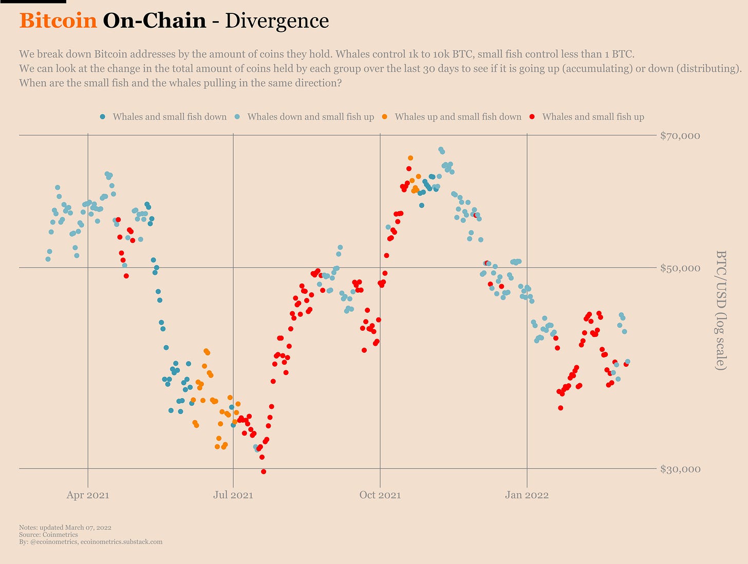
Meanwhile our favourite whales vs fish divergence signal is in the blue. That means the whales are pulling down while the small fish are pulling up. This kind of pattern hasn’t done much for Bitcoin’s price over the past year.
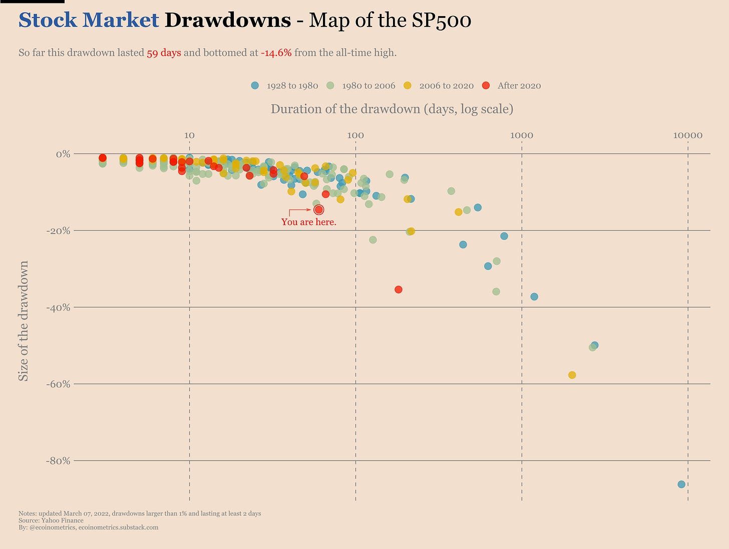
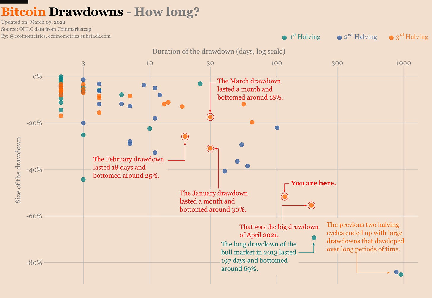
If nothing new comes up I’m afraid we are going to see the drawdown patterns of Bitcoin and the SP500 move side by side for a while.
Interactive data visualizations
This newsletter has a lot of charts. It is my opinion that good data visualizations can tell a great deal of things in a very efficient manner. That’s why I make so many of them.
Now the format of the newsletter means that all these charts are static. On the one hand that means I can tailor them to make a specific point as clear as possible. On the other hand you the readers cannot explore past what I’ve presented. And on top of that in many occasions you need to wait for the next newsletter to get the latest update.
We are fixing that.
All paid subscribers will soon have access to interactive versions of the most common charts I post in the newsletter on a dedicated website.
The charts will be organized by themes such as:
Bitcoin on-chain accumulation.
Tracking the drawdowns.
Bitcoin halving cycles.
Bitcoin risk metrics.
Central banks, yield and inflation.
And so on.
All the charts will be updated every time the underlying data changes. That typically means daily for things tracking Bitcoin or the stock market and weekly or monthly for economic data such as things related to the Federal Reserve.
When the website is ready paid subscribers will receive an invitation to setup their login to access the data vizs.
The first thematic page to be ready is the Bitcoin on-chain accumulation trend. You can access an early draft here.
Some charts are still missing from this draft and there are bug fixes and UX improvements in the work but we are getting closer to the final version.
That’s it for today. If you have learned something please subscribe and share to help the newsletter grow.
If you are already a free subscriber please consider upgrading to a paid tier to get the full access.
Cheers,
Nick


