Bitcoin is sticking to a well known pattern, will it continue in 2024?
Also the SP500 is about to reclaim its all-time high and counting down from the inversion of the yield curve
Welcome to the Friday edition of the Ecoinometrics newsletter.
Every week we bring you the three most important charts on the topics of macroeconomics, Bitcoin and digital assets.
Today we'll cover:
Bitcoin is sticking to a well known pattern, will it continue in 2024?
The SP500 is about to reclaim its all-time high.
Counting down from the inversion of the yield curve.
Each topic comes with a small explanation and one big chart. So let’s dive in.
In case you missed it, here are the other topics we covered this week:
If you aren’t subscribed yet, hit the subscribe button, to receive this email every week directly in your inbox:
Bitcoin is sticking to a well known pattern , will it continue in 2024?
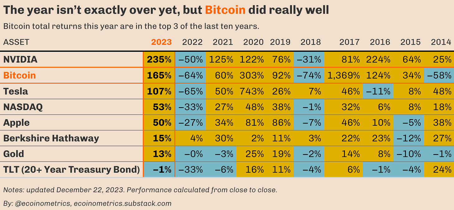
There is one more week to go until the end of the year, but already the situation is very clear. Bitcoin is one of the best performing asset of 2023.
If last year was the year of the correction, this year has been the year of the recovery. As of today BTC is up 165% and it is not even close to having reclaim its all-time high. Also the halving is coming up and you can bet that the BlackRock of the world are pushing hard to get those spot Bitcoin ETFs approved before that.
Look at the table below and you’ll recognise the 4-year pattern. One year down, three years up. The only thing that could mess this one up is a bad recession.
So let’s see how that plays out in 2024.
The SP500 is about to reclaim its all-time high
I’ve spend the whole year thinking that the stock market was going to move lower, that the rally was just another bear market rally. Yet here we are, the SP500 is a couple percent shy from reclaiming its all-time high and thus getting out of the drawdown sequence. The NASDAQ already did.
Clearly I underestimated Wall Street’s optimism in the face of so much uncertainty on the economic side.
But that’s a good example of why I recommend running a systematic trend following strategy as part of your portfolio. Regardless of where you think the market will go, at least you don’t miss the big moves entirely.
The debate is still open regarding whether or not the US economy will end up in a recession next year (and how bad it would be). The fact that so many analysts claim the Fed is achieving a soft landing makes me uneasy. We have discussed how the data isn’t clear on the soft landing over here.
But putting that aside if the SP500 manage to reclaim its all-time high within a few weeks then this drawdown will be very much in line with the typical time to recovery (duration of the drawdown on the chart below) based on the magnitude of the correction.
But watch out, the US economy falling into a recession could greatly extend the time to recovery of the stock market.
Counting down from the inversion of the yield curve
Why am I still talking about a recession? After all there is still no clear sign in the data showing it has started. Well the reason is the yield curve.
It has been inverted for a while now. A long while.
The table below shows you the number of months since a given spread on the yield curve has been inverted. If we focus on the spreads with the 10-year yield:
The 10-year minus 2-year inverted 20 months ago already.
The 10-year minus 1-year inverted 17 months ago.
The 10-year minus 3-month inverted more than a year ago.
You can use other spreads to date the inversion but the point is however you slice it we are getting in the typical range at which historically we expect to see the start of a recession.
Now there is no direct causation between inversion and recession. So it could be that things have changed. Or that we have an outlier on our hands. You could bet on that.
But the prudent way is to keep investing in liquid positions and be ready to cash out as soon as the US economy starts showing clear signs of weakness.
That’s it for today. I hope you enjoyed this. We’ll be back next week with more charts.
Cheers,
Nick
P.S. We spend the entire week, countless hours really, doing research, exploring data, surveying emerging trends, looking at charts and making infographics.
Our objective? Deliver to you the most important insights in macroeconomics, Bitcoin and digital assets.
Armed with those insights you can make better investment decisions.
Are you a serious investor? Do you want to get the big picture to get on the big trades? Then click on the button below.


