Ecoinometrics - Active Supply
February 23, 2022
Simple question. Is there any link between how many Bitcoins are moving around and the price action?
The Ecoinometrics newsletter decrypts the place of Bitcoin and digital assets in the global financial system. If you want to get an edge in understanding the future of finance you only have to do one thing, click on the subscribe button right below:
Done? Thanks! That’s great! Now let’s dive in.
Active supply
When I do research I typically start with one of two things:
A question. Then I look for data that can help me answer that question. E.g. can you predict ETH moves several days in advance by observing BTC?
A dataset. Then after some exploration of the data I try to extract some interesting features. E.g. let's look at the raw data regarding changes in holdings by addresses, which is how I came up with some ideas around the accumulation trend.
But the topic of today is kind of a blend of the two. We are going to talk about an on-chain metric called the active supply of Bitcoins.
The active supply over D days is the total amount of coins which have moved around at least once in the past D days.
This is a simple measure of on-chain activity which doesn’t require too much subtlety in its interpretation. I like that. If possible it is always better to keep it simple.
You can calculate this active supply over any time period. Today I’ve decided to look at a mid-range period of 90 days which is conveniently provided in the Coinmetrics dataset on Bitcoin.
What can the active supply over the last 90 days tell us about Bitcoin’s price action over a 3 months horizon? Is there any difference in the active supply dynamic between a bull and a bear market? Can changes in the active supply help predict Bitcoin’s moves?
Those are the questions.
So where do we start?
Well first of all what’s the typical amount of active coins during a given 90 days period. If you had asked me before I peeked into the data I would have guessed that since 90 days is about a quarter of the year then it must be something like a quarter of the total supply. So around 4.5 million BTC per quarter.
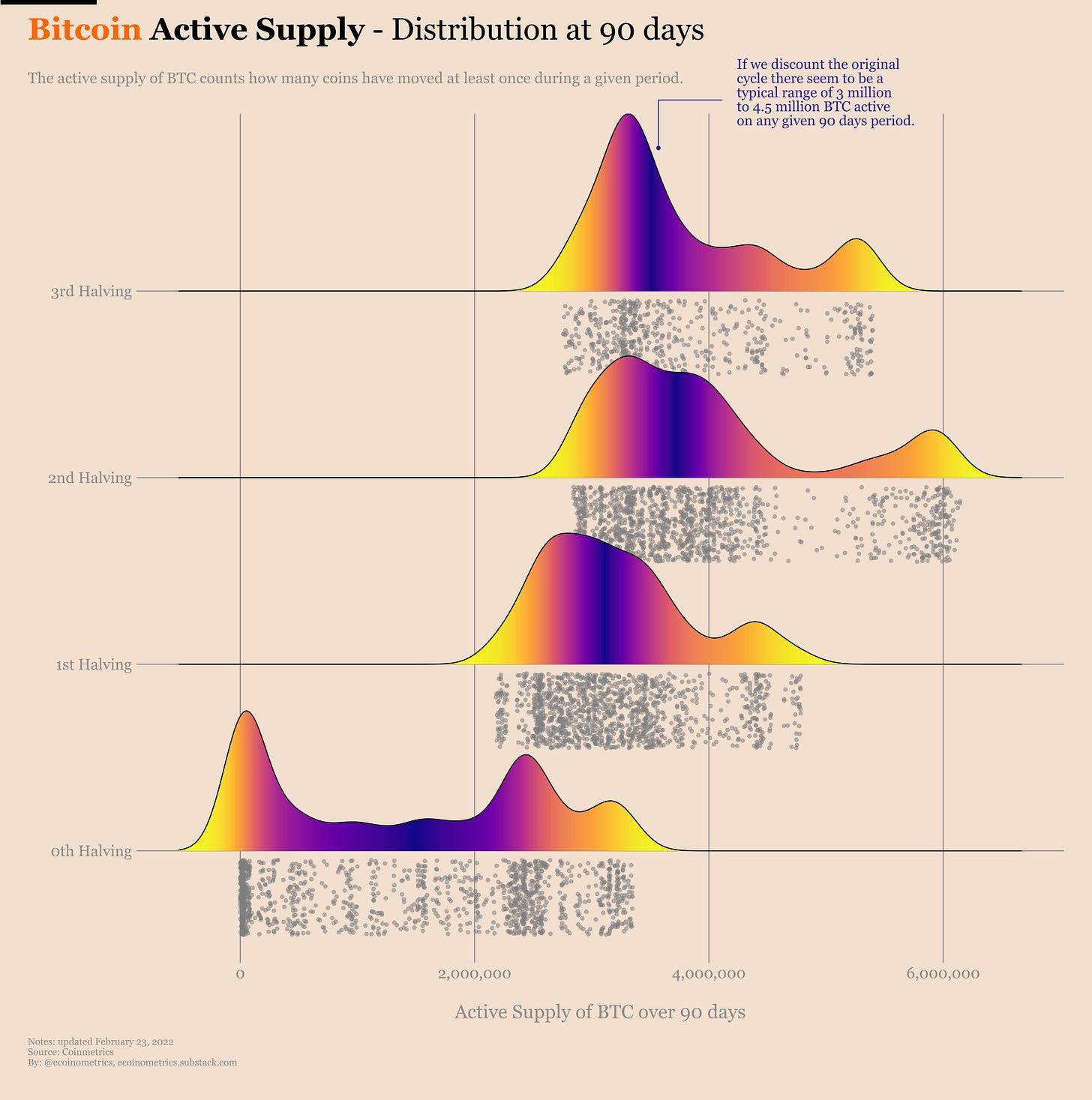
Turns out this is not a stupid guess. Take a look at the breakdown of the distribution of the active supply over 90 days by halving cycles.
If you ignore the original Bitcoin cycle which is naturally an outlier (given that the total supply was pretty small at the time), you see some sort of pattern emerge:
Most of the time the active supply over 90 days is in the BTC 3 million to BTC 4.5 million range.
Each cycle has some outlier region of more intense activity.
So naturally we can guess that this intense activity happens during the bull runs. But to be sure let’s plot the price evolution of Bitcoin with every day colour coded based on the active supply.
Check it out.
Right, so we see some stuff here.
Those outlier regions of intense on-chain activity do tend to coincide with parabolic moves. The bear markets also do tend to look more blue and green than anything else.
In that regard this 3rd halving cycle is interesting:
There was an intense activity period during the first quarter of 2021. This is when Bitcoin pushed above $60k for the first time.
But after the crash the active supply started to seriously cool down similarly to what happened in 2013. And the push to the latest all time high at around $69k happened without much activity at all.
So maybe there is some truth in saying that Bitcoin is in a bear market. At least the activity level we see is compatible with a bear market.
Okay. Maybe except for that last bit I don’t think you are being shocked by any of these observations. Neither am I.
What about the juicy things though? Can we somehow use this active supply metric to make price predictions?
Well, let's see.
First of all is the active supply over the last 90 days related in any way to Bitcoin’s returns over the same period?
Take a look, for each cycle we have plotted the active supply on the horizontal axis and the BTC returns over the same period on the vertical axis.
Ok, it is true that the highest returns happen during the periods where the active supply is also at its highest.
But there are two issues:
First, the highest region of active supply is changing from cycle to cycle. So it is not like you can make up an easy buying decision based on that.
Second, this chart shows the lagging returns. That is by the time you get to a given value of the active supply, the price action has already happened…
What if we tweak things a little bit and plot the leading 90 days BTC returns after a given reading of the active supply? That’s what we need to see if the active supply is predictive of anything.
Well… bad news… see for yourself.
This thing is all over the place. Maybe you can find some hidden pattern but honestly I don’t see anything robust emerging out of this picture.
Just to be sure we can conduct a lead or lag analysis to see if changes in the active supply over 90 days are leading or lagging changes in Bitcoin’s price.
For a more detailed discussion about how this kind of analysis works you can check this post where we looked at how BTC is leading ETH.
It takes some effort to wrap your head around this one, but bear with me, at the end of the day it is pretty simple.
You can interpret the chart below as follows:
Each row gives you some information about the correlation between the active supply over 90 days and BTC on a given date.
At the centre of the heat map we just look at how the active supply is correlated to BTC.
Moving to the right we look at how the active supply a few days prior is correlated with BTC now. The more red we see in that zone the more it is a sign that the active supply is a leading indicator of Bitcoin’s moves.
Moving to the left we look at how the active supply a few days after is correlated with BTC now. The more red we see in that zone the more it is a sign that Bitcoin’s moves are actually a leading indicator of where the active supply is going.
The calculation on each row is done over a rolling window. This rolling window moves over time along the vertical axis.
Phew… the tl;dr is if you see a lot of red on the right side of the chart it is a sign that the active supply is a leading indicator for Bitcoin.
So what do you observe?
Right, there is no consistent pattern.
So that settles it.
The active supply of Bitcoin at the scale of a few months doesn’t have much predictive power. It is a nice indicator to guess what kind of regime the market is in but there is no systematic pattern we can latch on to inform our trading strategies.
Time to go back digging into more on-chain data…
CME Bitcoin Derivatives
If you have read Monday’s update on the market conditions you know that there are no reasons to be super optimistic in the short term. Not until we get a clearer picture of what the Fed is going to do to rein in inflation.
That being said, it isn’t all bearish news.
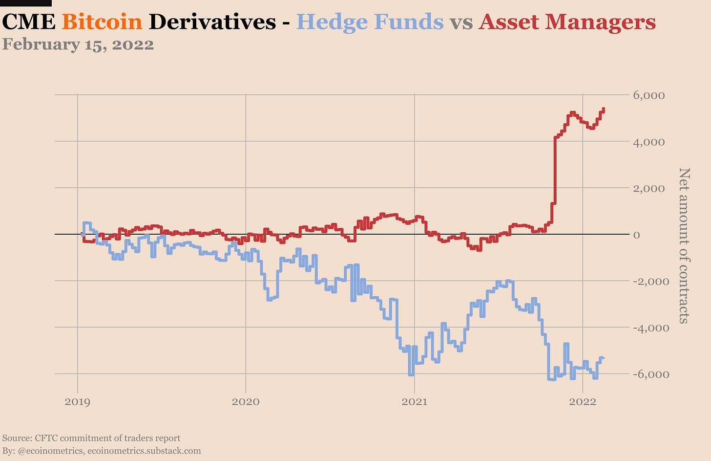
Take the asset managers on the CME. They just posted another record high amount of net long positions. Which means that there are buyers of the Bitcoin futures ETFs at this price.
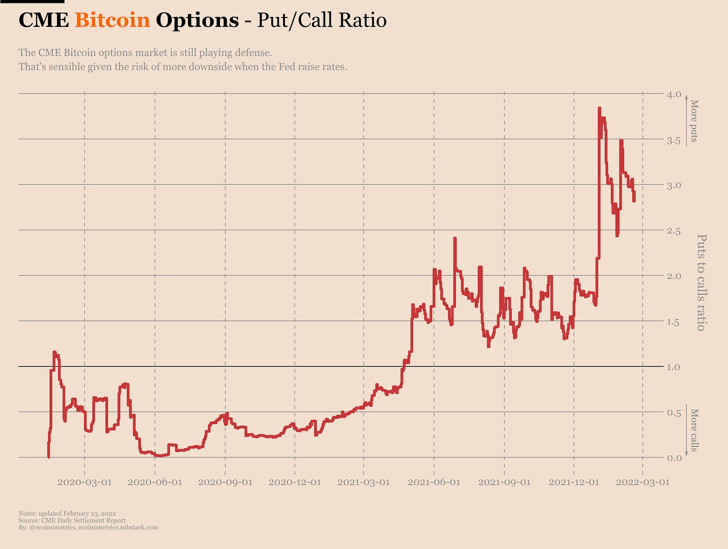
But at the same time the puts to calls ratio on the CME Bitcoin options market remains at 3 puts for every call. Which means that the “more sophisticated” investors consider that it is worth having some insurance against another dip.
Another dip okay, but how low? Well 50% of the puts are on strikes below $30k. So that gives you an idea on what the market expects in the short term.
Let’s see how that plays out.
That’s it for today. If you have learned something please subscribe and share to help the newsletter grow.
If you are already a free subscriber please consider upgrading to a paid tier to get the full access.
Cheers,
Nick


This is a really important post because I know a lot of analysts in the community who would have just posted the first plot and claimed a relationship. Negative results get no traction in the world of social media, so instead we see so many people focusing on less useful relationships that look at first glance really promising (e.g, most metrics including STH Realized Price).
Good work.
Great analysis. 👍
However, with rise of derivative trading (CME for past three +years and stable coins margined perpetual contracts) maybe on chain metrics are not that indicative. Also with GBTC having a large locked up supply should have been more of a supply squeeze, since these coins don’t move.
It’s odd that the on chain metrics for exchange supply and others are relatively bullish yet the price action is weak. IMHO, a lot of profit taking took place in December ‘21 and macro economic (rate hikes, inflation, oil prices)) and geo political (Russia/ukraine) caused a downturn. It’s hard being bullish given this scenario.