Ecoinometrics - Exchanges outflow
October 06, 2021
The price of Bitcoin is set on the exchanges.
So obviously any info you can get relative to the situation over there can give you a hint of where the price could be going.
But right now one metric is pretty bullish…
The Ecoinometrics newsletter decrypts Bitcoin’s place in the global financial system. If you want to get an edge in understanding the future of finance you only have to do one thing, click on the subscribe button right below:
Done? Thanks! That’s great! Now let’s dive in.
Exchanges outflow
How much volume is traded? How much leverage is applied to the market? How are the derivative traders positioned? That’s valuable information for the price action.
But there is something more fundamental that comes before all that: how many Bitcoins are actually available on the exchanges?
Low supply? Probably means investors don’t see any reason to sell their coins. Likely bullish.
Lots of coins being moved to exchange addresses? That’s not great. Probably means hodlers think it is time to sell.
Pretty simple right? And as long as you maintain a list of all the addresses associated to the exchanges, tracking inflows and outflows is very much transparent.
Now, we could be looking at the absolute level of BTC held by exchange addresses. But I find it a bit more enlightening to look at trends instead.
So the first step is to look at the daily net flow associated with the exchange addresses. On any given day take the total amount of coins going in exchanges, subtract the total amount of coins going out and you get the net exchanges flow.
When that number is positive the supply on exchanges is increasing. When the flow is negative the supply on exchanges is shrinking.
For this cycle I’ve overlayed this daily net exchanges flow to the price action of BTC. Blue means lots of coins got out of exchanges that day. Red means the opposite.
Check it out.
Now, what you can see is that large one-day outflows (blue) don’t necessarily mean an immediate price pump. And while some of the price dumps are preceded by large on-day inflows (red) it isn’t always the case.
So it is pretty hard to say that there is really a direct correlation between the one-day flows and the price action.
The good thing is, if you aren’t a short term trader, it doesn’t really matter. What is more important is the long term regime we are in.
So let’s zoom out a bit. Instead of the one-day net flow let’s look at the 30 days net flow. The picture suddenly becomes much clearer.
Blue means that Bitcoins have been flowing out of the exchanges over the past 30 days. Red means coins have been flowing in.
Well, so far in this cycle we have seen a lot of blue… and you know what? It looks like exchanges are turning blue again… probably nothing.
This dynamic of a drying supply on the exchanges is quite interesting when compared to the previous halving cycle.
Back then there were indeed periods of net outflows but in terms of size they look much less dramatic than what we have right now.
That’s another sign that we are on course for a liquidity crisis which could drive Bitcoin’s value much higher than it is right now.
And the thing is, this is not the only signal that supports the idea of a breakout move for Bitcoin. Most types of hodlers, from small fish to whales are back in an accumulation phase on a 30 days basis.
So when it comes to the participation score Bitcoin is moving away from the dangerous blue zone and back towards a regime very much supportive of a parabolic move like the one we have experienced at the end of last year.
Combine that with the fact that the market as a whole is only up 2.4x on its positions and what you get is a lot of reasons to think we are moving towards BTC at six figures.
Of course nothing is guaranteed in life. You could get a setback on the Bitcoin ETFs approval process from the SEC, a stock market crash, some Elon Musk FUD or god knows what happening anytime. Those things we can’t predict.
But if we stick to the actual data for the macro trend, I’d say we’re gonna make it.
CME Bitcoin Derivatives
Apparently though, the CME traders don’t read this newsletter. I mean do you want to see what a paper hands chart looks like?
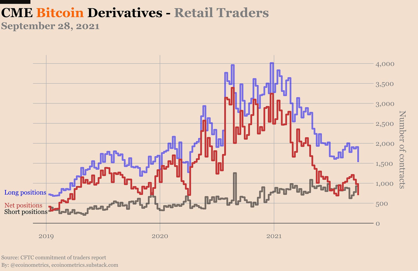
Let me show you right here. See this big drop in the long positions of the retail traders?
That’s paper hands 101.
Most likely this dip is due to a mix of traders not rolling their long positions to the October contract and some outright liquidating when BTC looked like it was going to drop below $40k last week…
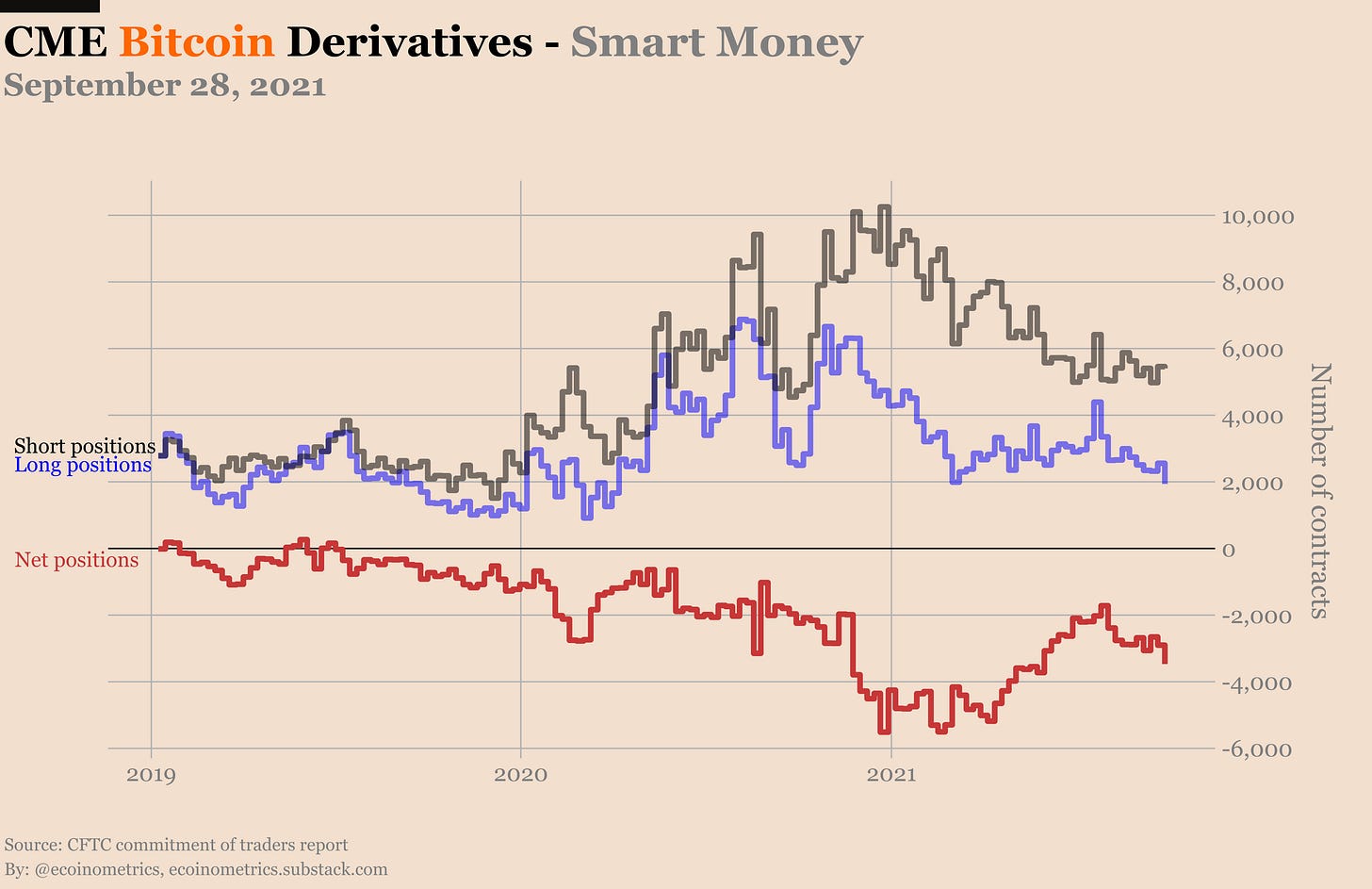
Regardless, the overall picture is that the futures traders lack conviction.
The same is true on the options side. There are still twice as many puts as calls despite BTC looking like it is going to break out.
Some traders did bet that we’ll move above $60k by the end of the month though. So we’ll see if having convictions in the trend ends up paying in the coming weeks.
That’s it for today. If you have learned something please subscribe and share to help the newsletter grow.
Cheers,
Nick


Thanks Nick, fantastic write up as always. Appreciate your work.
I always find myself looking forward to your next article, these are far and away the most useful insights on crypto to be found anywhere online. Amazing job.