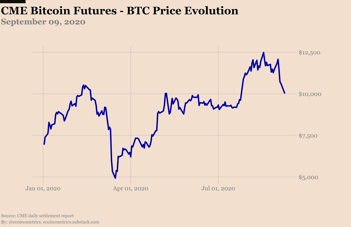
September started pretty well right? Bitcoin was trading just below $12,000. You could almost smell $14,000 around the corner and then the moon…
But that didn’t last long and now Bitcoin is wrestling with $10,000. Did the market sentiment turn?
The Ecoinometrics newsletter decrypts Bitcoin’s place in the global financial system. If you want to get an edge in understanding the future of finance you only have to do two things:
Click on the subscribe button right below.
Follow Ecoinometrics on Twitter at https://twitter.com/ecoinometrics.
Done? That’s great! Thank you and enjoy.
I don’t think so.
If you think from a technical perspective what we are getting right now is Bitcoin flipping a former resistance level at $10,000 to become a support.
From May to the end of July, Bitcoin was desperately stuck below $10k. But for 7 days now $10,000 is holding strong.

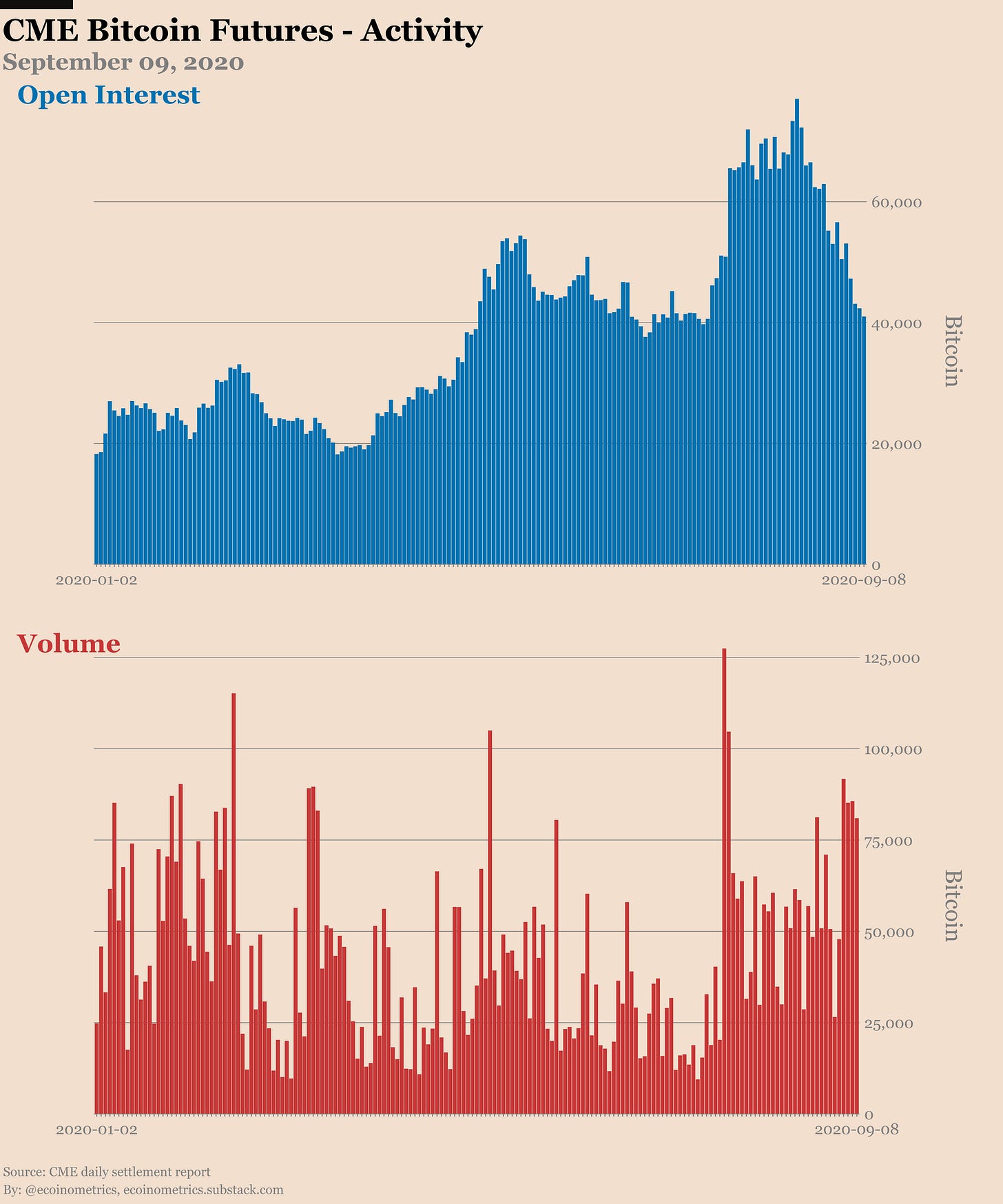
We might just be in the process of shaking out the weak hands. Take a look at the trading activity on the CME Bitcoin futures.
When the breakout above $10k occurred at the end of July we got a massive influx of new positions. But since BTC failed to continue on its growth trajectory the open interest has been on the decline.
That did not start with the move down to $10,000 last week.
Now we are back to 200,000 BTC worth of open positions which is the same level as before the breakout.


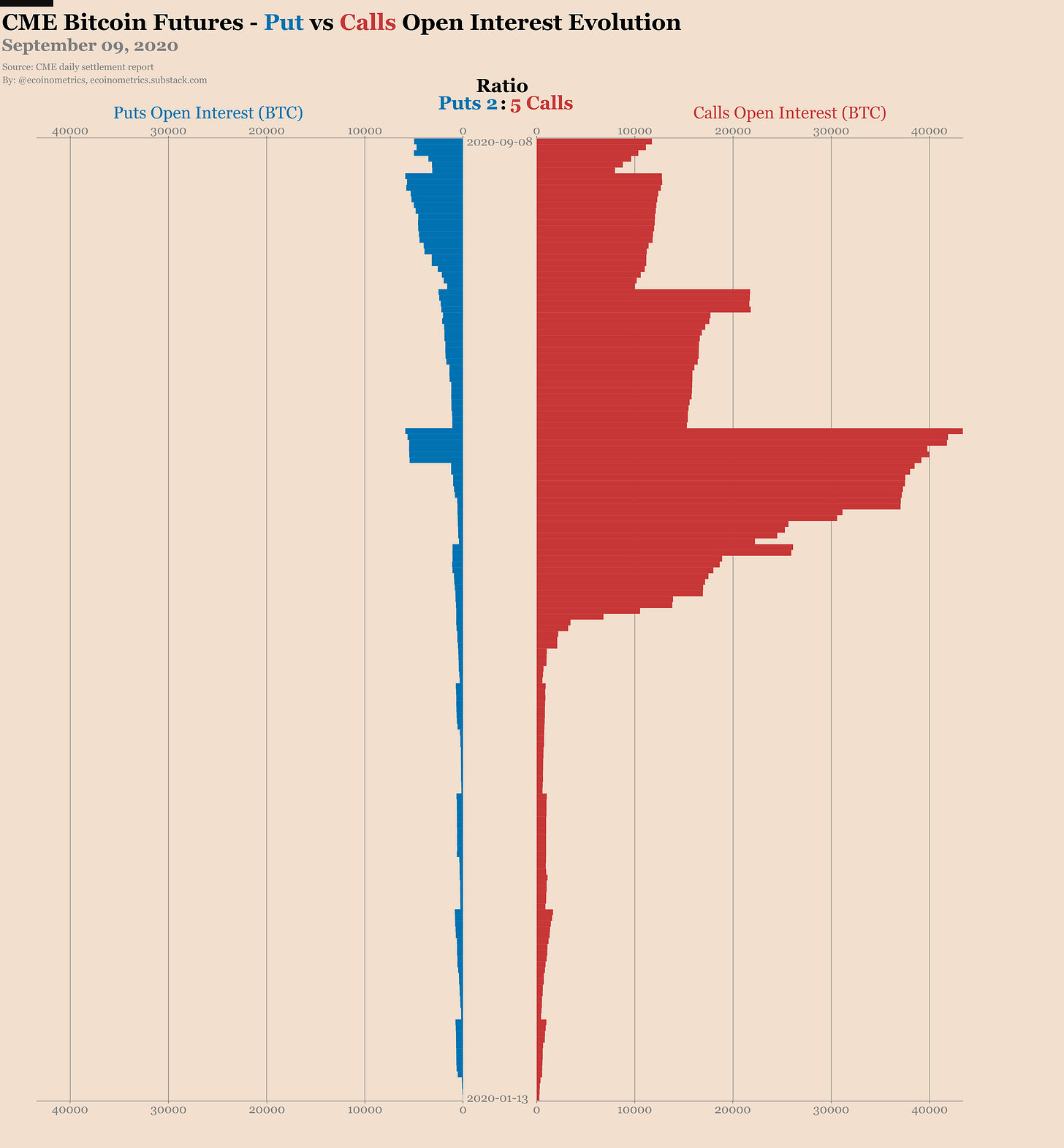
On the CME Bitcoin options market the calls continue to dominate the scene with 5 calls for every 2 puts.
But the dynamic of those options trades is telling us something about the general sentiment in the market.
You have to look at the difference between the near month (Sept’20) and the back months:
In the near month the puts to calls ratio is 1 for 1.
In the back months you have 4 calls for every 1 put.
So pretty clearly option traders are buying puts on the front month to protect themselves or benefit from what they might perceive as a short term drop.
But for the long term the bullish sentiment is pretty much unchanged.


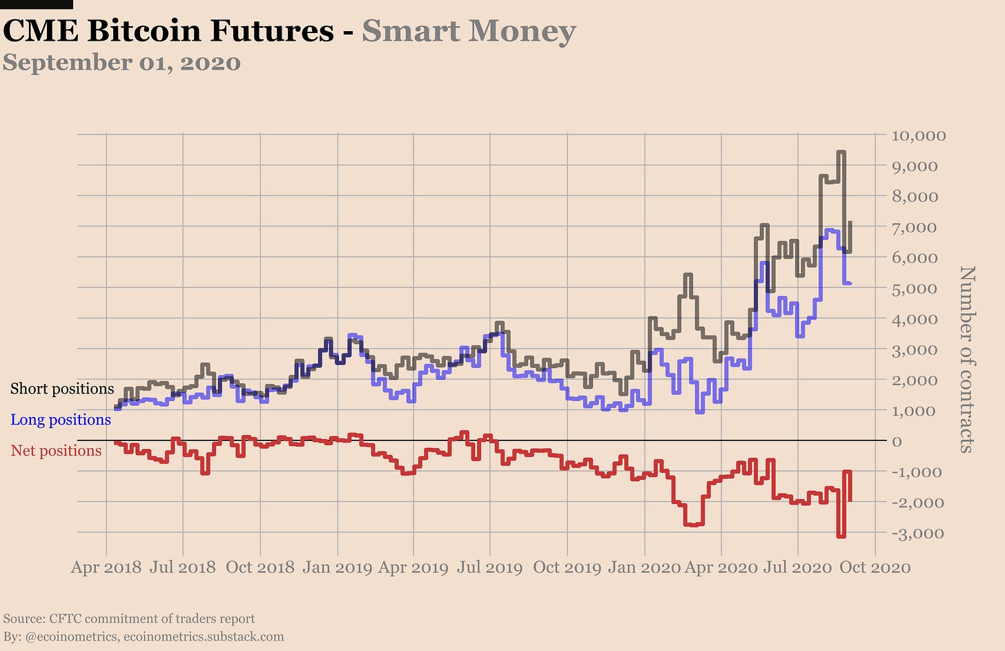
The latest Commitment of Traders report is dated from September 01. So it doesn’t have anything to tell us about the recent drop in price.
It does look like the previous report was just a blip in the data and not the start of a new trend though:
Retail traders net long is starting to move up again after last week’s drop.
The smart money is moving back to be net short 2000 contracts.


When you break things down the situation is even more clear. On the retail side the massive increase in short positions is now completely erased.
At the same time retail traders also continue to liquidate their long positions.

The smart money is adding to their short positions most likely to get back on the cash and carry trade.
At the same time the funds didn’t touch their 25,000 BTC worth of long positions.

The reaction of the different market participants to the Bitcoin drop back to $10k will be interesting to see. But that’s for next week.
For the second part of this letter I want to talk charts.
Every day on Twitter I publish a number of charts that track various metrics in the Bitcoin futures and options market.
Some of those charts are pretty standard: the price evolution, the daily traded volume or the evolution of the open interest are familiar to most people and easy to read.
But other charts might be more difficult to interpret. It could be because they are plotting quantities that not everybody is familiar with. Or it could be that I’m using non-standard representations.
People have asked me to give some explanations on how to read those non-standard charts. So from time to time I’ll dedicate a portion of the newsletter to explain what is on those charts, how to read them and how you can interpret them.
Today I’ll start with two of those charts that appear in the daily CME Bitcoin options activity report:
The evolution of the puts to calls ratio.
The open interest evolution heat map.
The puts to call ratio is pretty easy to understand. You take the total number of open put contracts and divide that by the total number of call contracts.
The idea is that on aggregate if the market sentiment is bullish people will want to buy calls to benefit from upside moves.
Similarly if the market sentiment is bearish traders will on aggregate buy lots of puts to protect against downside risk or benefit from downside moves.
So if there are more puts than calls the ratio will be larger than 1 and overall you can gauge that the market sentiment is on the bearish side.
If there are more calls than puts then the ratio is smaller than 1 and you could guess that the market is bullish.
At a high level, this chart is showing us if the positions are biased towards the puts or the calls.

Beware though that this is telling only a partial story.
As we have seen regarding the current state of the options market there can be very different ratios on the near month vs the back months.
Also for every contract open someone is long and someone is short. Which market participant is long or short those contracts and at which strikes those contracts are traded could lead to different interpretations.
But I just want to give a high level view of the chart here so let’s not dig into all the possible interpretations.
Instead let’s move on to the open interest evolution heat map. As far as I know this is not a standard chart so it takes a little bit of explanation to understand.
If you want to visualize the evolution of the total open interest things are easy. You just plot a line chart with time on the x axis and the open interest on the y axis.
But on the options market you can get the open interest for each strike. So what if you want to visualize the evolution of the open interest for each strike on the same chart? Well you need another strategy....
What you need is a heat map:
On the x axis is time flowing from left to right.
On the y axis are the strikes.
For each cell (that is a given date at a given strike) the open interest is encoded with a colour gradient. The darker the colour the larger the open interest.
Check it out.

If you follow a given strike from left to right you can see when new positions are being created and when they get liquidated.
At the same time for any given day you can see which strikes have a lot of open positions and which strikes are empty.
When you combine all that it helps to visualize the market dynamic.
As an example you can see that at the beginning of June while Bitcoin was still trading in a range below $10,000 traders started buying calls at $10,000 / $11,000 / $13,000 and so on anticipating a break out.
Their timing was bad and you can see those positions fade away over time while other levels attract new interest.
This is the kind of thing the open interest evolution heat map allows you to spot pretty easily.
But the important thing to remember is that there isn’t a single metric that will give you the secret of what’s going on in the market.
There is no silver bullet.
Each thing you can look at gives you a partial picture of the situation.
What we are doing here is viewing the market from different angles, understanding the limitations of our tools and putting things back into context to build a coherent story.
That’s it for today.
If you have learned something please subscribe and share the newsletter.
And don’t forget to stack sats!
Cheers,
Nick
The Ecoinometrics newsletter decrypts Bitcoin’s place in the global financial system. If you want to get an edge in understanding the future of finance you only have to do two things:
Click on the subscribe button right below.
Follow Ecoinometrics on Twitter at https://twitter.com/ecoinometrics.
Done? That’s great! Thank you and enjoy.


